
Tuesday, April 28, 2015
Revisiting the King
Here's an updated MLK poster, I added the Engine Room logo and changed up some of the font type and size.


Monday, March 23, 2015
Something to Look Forward to
My ad series for The Engine Room is an event that they do during the summer months called "Movie at the Mill." And I have chosen probably one of the greatest blast-from-the-past movies ever to promote as the event of the summer.

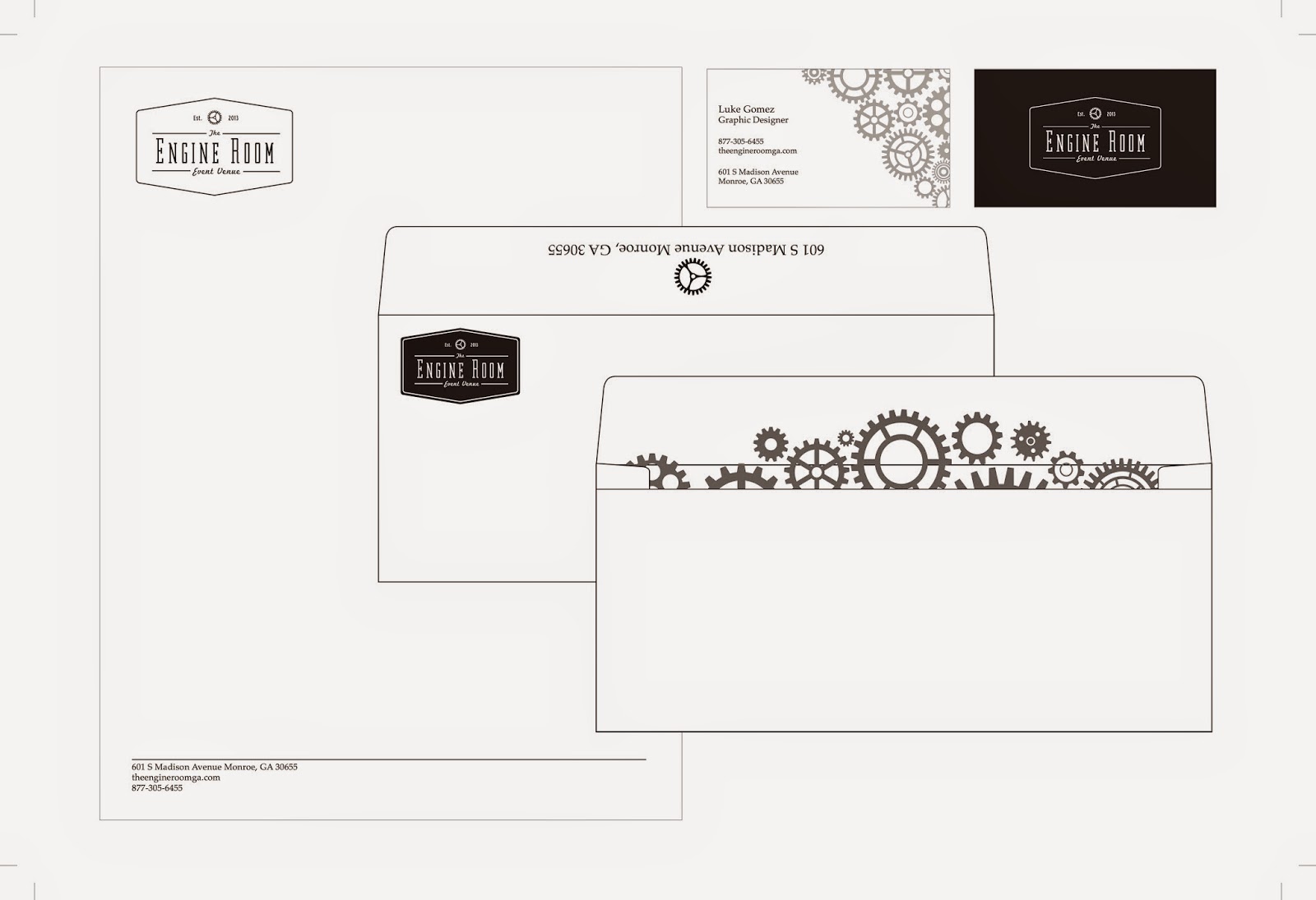
Stationary Set Up
Here are my Stationary pieces; including a letterhead, a business card, and an envelope to seal the deal.

Don't Take Everything at Face Value
The company I decided to choose is an event venue called 'The Engine Room.' It's located in the small town of Monroe GA and is a unique vintage venue with original flooring and rustic brick walls. The owner bought an old cotton mill and converted it into the venue it is today.


Here is their current logo, I feel that it's very modern looking for a place that prides itself on it's rustic look. I also feel that it's bulky and doesn't clearly show what the engine room is.
This is the logo I did for them, I feel that it's got a more spaced out feel and conveys a more vintage look that will captivate the eye of anyone looking for a unique environment to celebrate an important moment of their lives.
Tribute to the King
Here's my MLK poster from earlier in the semester. There is some tweaking that I want to do but for now I'm happy to put it here

Sunday, January 25, 2015
The Trio of My Choosing
The three companies of my choosing to work on are as follows.

Gezzo's is a west coast influenced food truck serving all the greatest foods ever, tacos and burritos. I really like the cross cultural cuisine they have come up with, drawing inspiration from both west coast and Hawaiian influence in their food. The website has a great layout but I'm not a fan of that logo.
http://www.gezzos.com

Another company that I looked into we discussed in class. Allegra is a local printing company and they seem to have a good idea of what looks appealing and what doesn't. My problem with them is the fact that they're in a bit of an identity crisis by the fact that they have both new and old logos together on their website and both are conflicting in regards to presentation. Also I'm not a fan of the fact that Allegra calls itself that, it makes me think of the medication before I read that it says printing underneath.
http://www.printingimpression.net

http://www.gezzos.com
http://www.printingimpression.net
The third and final company I was thinking about redoing is the Freshcoat painting company. This one doesn't even have a logo and is probably the most needy when it comes to a makeover in branding.
http://freshcoatservices.com
The Good, The Bad, and The Ugly
Here are some examples of the better logos that I stumbled across in my search.


And then there are some that I feel could use some work.


Wednesday, January 14, 2015
This is, in my opinion, some of the best work I created in the fall semester 2014.

This is a logo I designed out of my initials LG.

This is a mock up poster I created for one of my favorite bands, Family Force 5.

This one is a book cover design I made for the Lord of the Rings books.

In my typeography class, I had to use a quote and only help covey its meaning without
the help of images.

My final piece is a mural design I created using only letters and symbols.
Subscribe to:
Comments (Atom)